
Bitcoin: Don’t Watch the Price—Watch This

Posted May 22, 2025
Chris Campbell
Bitcoin’s at all-time highs.
If you bought at any time prior to today, congrats. You’re up.
But now we’re at the tricky part. Everyone’s wondering the same thing…
Is it time to sell?
Obviously, the Bitcoin maxis say no. (But they always say no.)
And this time, I agree with them.
Here’s why…
Something Big Flipped
Let’s say you’re trying to figure out what the smartest people in the room are really doing with their money.
You could eavesdrop on their conversations, sure. But there’s a better way.
You watch what moves.
In crypto, that means going on-chain.
Because no matter what the headlines say, what influencers post, or what your neighbor Frank tells you at the dinner party—blockchains don’t lie. They show you what’s happening under the hood.
Bitcoin’s on-chain activity is like the heartbeat of the network. When it starts racing, it means people are moving BTC, buying, selling, holding tight, or gearing up for something big.
When it flatlines, you’re likely in the middle of a ghost town—at least temporarily.
And for the past several months, Bitcoin’s heartbeat was faint. Even as price bounced around, the actual usage on the network was slipping. That’s the kind of mismatch that usually screams: "Careful—this rally might be fake!"
But now?
Something changed.
The downtrend in on-chain activity just snapped. And that matters—big time.
A Pulse in the Protocol
So here’s the good news:
May is giving us our first legit heartbeat in a while.
Short-term activity is still kinda sleepy—no parabolic user surge yet—but long-term metrics? They’ve stopped bleeding out. That’s what analysts call a regime change.
In the old days, cycles were simpler:
- Whales (early BTC holders) buy in bulk.
- Retail FOMO kicks in.
- Whales dump.
- Retail cries.
- Repeat.
But this time, something’s different. The whales aren’t just laser-eyed Bitcoin bros and shadowy supercoders anymore. They’re companies—public ones.
And they’re ETFs.
Spot Bitcoin ETFs didn’t exist during the last cycle. Now, they’re soaking up BTC at record speed—over 60,000 BTC in the past 30 days.
Every time an ETF issues new shares to meet demand, it has to buy real BTC. That BTC moves. It leaves wallets. It hits the chain.
That shows up as—you guessed it—on-chain activity.
And that’s exactly what we’re seeing.
What to Watch
So let’s say you want to know what’s really going on with Bitcoin…
Don’t just stare at the price chart like it’s a magic eye puzzle. Watch the chain.
NOTE: These metrics aren’t crystal balls—Bitcoin’s still a wild beast—but they’re better than whatever the Twitter bros are selling.
Start here: If active addresses are climbing, it means the network’s buzzing… a good sign.
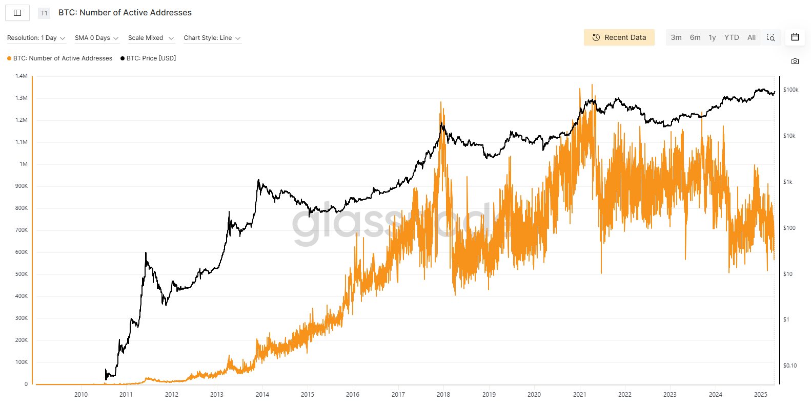
This chart below shows the number of active Bitcoin addresses (orange) versus Bitcoin’s price (black). Historically, when active addresses rise with price, it means real users—not just speculators—are driving demand. That’s healthy growth.
Right now, even though address activity is still below peak levels, it seems to be stabilizing after a decline, while price is climbing.
Next, follow the flow.
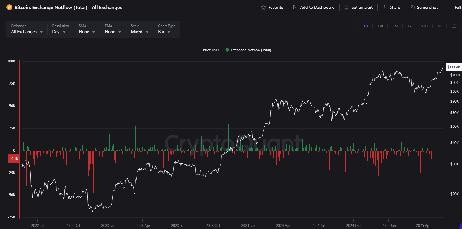
When coins move into exchanges, that’s often a precursor to selling. But when BTC is flowing out—tracked through exchange netflows—someone’s tucking those coins into cold storage. Usually, that someone thinks in quarters or years, not memes.
In the chart below, red bars mean more BTC is leaving exchanges than entering—usually a sign of accumulation as coins head to cold storage. And when that lines up with rising prices? That’s a bullish cocktail.
In short: fewer coins on exchanges = less sell pressure = fuel for higher prices.
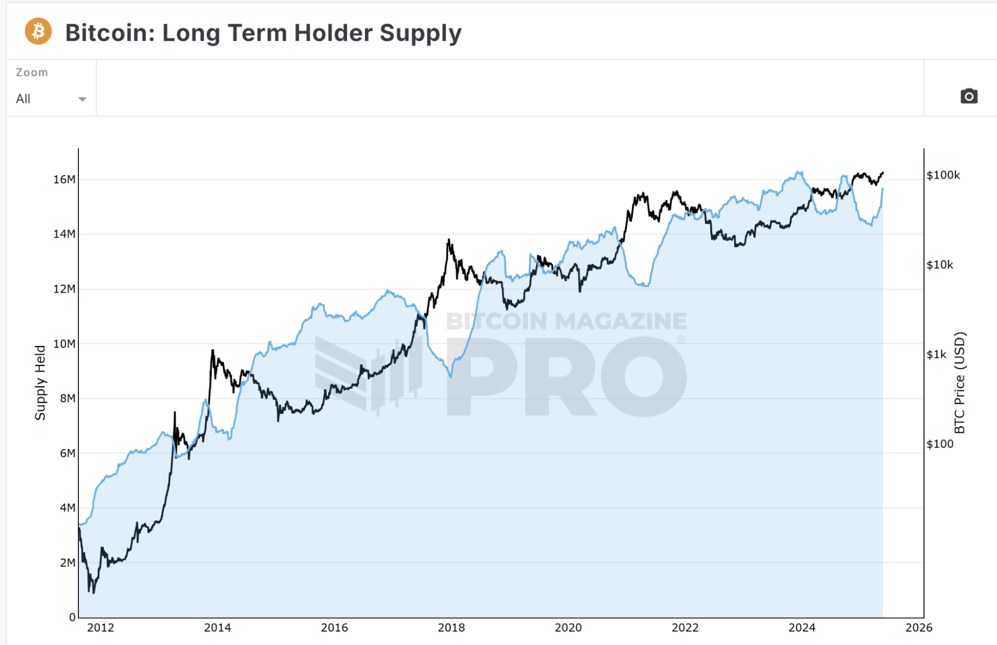
Then peek at the conviction crowd—the long-term holders. These are the addresses that haven’t moved in 155 days or more. When that supply goes up, it’s usually a great sign.
The chart below shows that long-term Bitcoin holders are stacking again, even as prices push higher—meaning they’re not selling into strength, they’re expecting more upside. Historically, when this blue zone rises, it signals quiet accumulation before major bull runs.
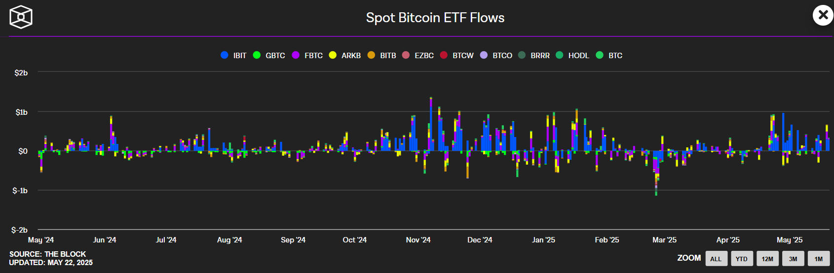
Another one: Track the ETF inflows. When everyone decides they like Bitcoin again, those funds start buying—fast.
And every new ETF share minted needs real BTC to back it. That’s not speculation. That’s physics. You can literally watch it show up on-chain.
This chart shows daily flows into and out of spot Bitcoin ETFs—each color representing a different fund. When bars are mostly above zero, it means money is flowing into ETFs, which forces them to buy more Bitcoin.
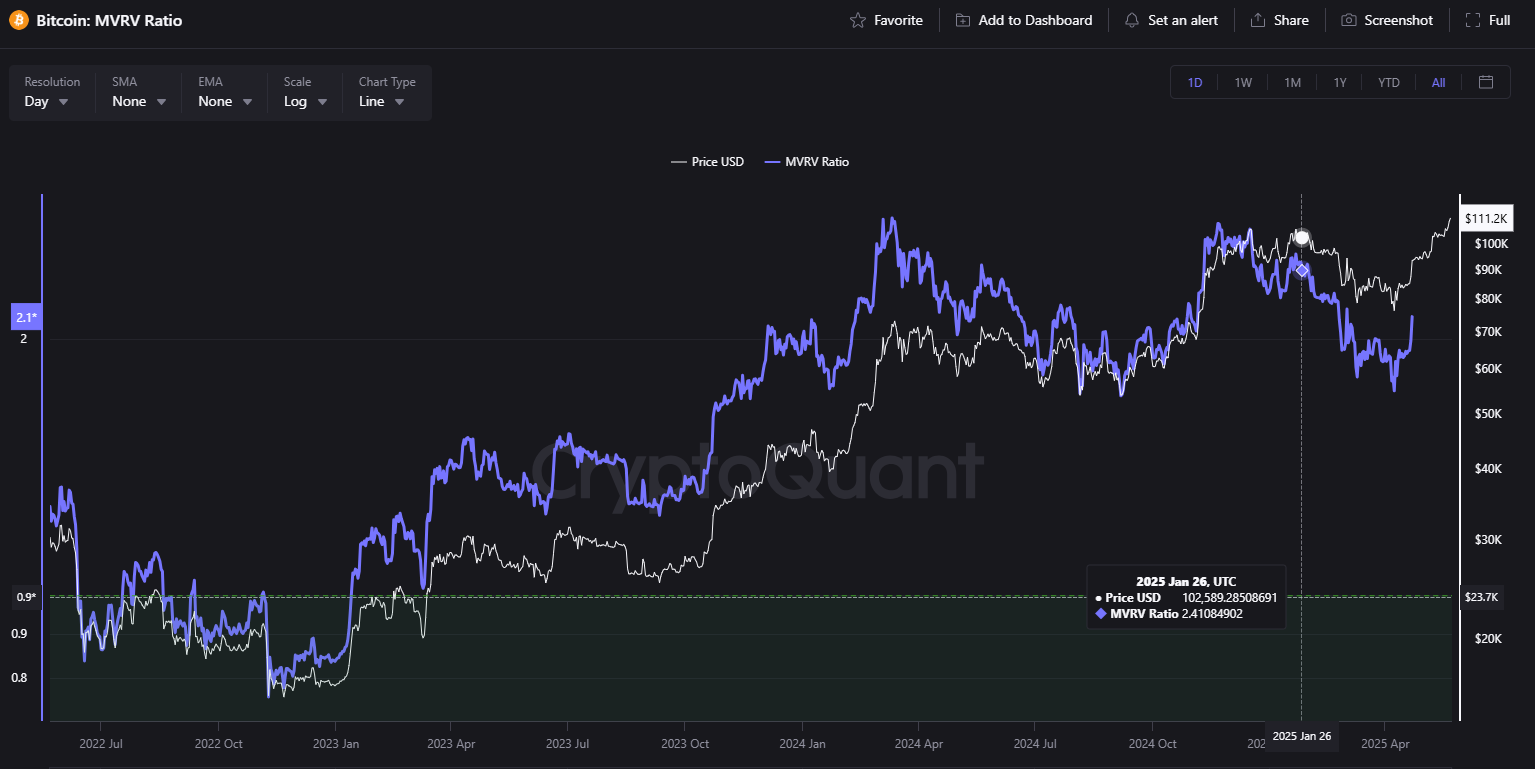
Still unsure whether we’re in a bull or bear? There’s a cheat code: MVRV (Market Value to Realized Value) ratio. It compares price to the average cost basis. Red-hot? Danger. Ice cold? Opportunity.
As a rule of thumb: MVRV above 3.0 is historically red-hot (get cautious), 1.5 to 2.5 is the sweet spot (neutral-to-bullish), and below 1.0? That’s your bargain bin.
Right now, we’re at 2.1.
See for yourself: This chart tracks Bitcoin’s MVRV Ratio (blue line) against price (white line).
Right now, MVRV just bounced from 1.7 and is rising again, showing the market is still far from euphoric levels—seems bullish, because there's likely more room to run before we hit greed-driven peaks.
The bottom line? If price is the headline, on-chain data is the footnote that tells you what’s real.
The network is whispering.
And now you have a better idea of how to listen.